
Parts:
1. Building the Main Layout Structure. (00:00)
2. Wrapping the Code into a Container Div. (07:17)
3. Building the Main Navigation Menu. (10:38)
4. Structuring the Content Boxes. (17:23)
5. Building the News Feed Area. (20:42)
6. Setting the Footer Structure. (24:38)
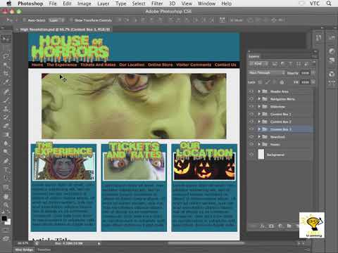
Leap into the world of adaptive web design with HTML5 & CSS3 Responsive Web Design! With FT as your guide, you’ll learn how to build wireframe responsive designs in Adobe Illustrator, apply design and graphics to them in Photoshop, and then rebuild the designs in code. Discover the power of CSS3’s media queries to target various devices and resolutions, including mobile, tablet, and desktop browsers. Learn how to extract Photoshop content for use in your designs, insert it with modern HTML5, and control it with a variety of CSS3 techniques. By the end of this FT course, you’ll have three beautiful designs, each one displaying automatically depending on the device being used to view it.