
A layout can be both one of the simplest and one of the trickiest aspects of web design. Every web design layout has some uniqueness and purpose to it. Understanding the underlying purpose of different layout could help you achieve a fantastic web design for your business. However, as the design has taken a greater and much more influential role in shaping businesses, more and more thought has been given to the type of web design layout incorporated in any website. This led to a much greater collaboration with the designers and their fellow developers.
Great looking websites often use layouts that are relatively straightforward and unique in every aspect to be worth the time and the client’s money. However, if you look around the web, you’ll see that this isn’t necessarily the case. Companies need to analyze which devices their target audiences are using to view their website on in order to discover the best design layout of their website. As the layout determines the overall visual appeal of your website, collecting some basic ideas on the different types of web layouts won’t be a bad idea.

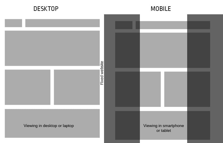
#1 Fixed Design
A fixed design is a fundamental layout that is widely preferred by many. As the name suggests, the components of the website are packed within fixed widths or percentage widths. This means that the width won’t alter when the browser is resized, no matter what kind of device the website is being viewed upon.
A fixed website design layout has a set of fixed-width, along with the necessary elements inside it. On smaller devices, such as smartphones or even tablets, images or content is much harder to view and can be quite frustrating for some users due to the need to scroll horizontally just to see the rest of the page. In addition, users need to press and zoom in to read the whole text continuously. If it’s being viewed on a larger screen, images and text may visually fall apart on the display itself. Most website users are expected to browse in higher resolution or in a greater fixed design layout. With that said, it is clear that whoever is viewing a website in any kind of browser or device will definitely experience the components within the same fixed widths, and they won’t move an inch. So, even when viewed in different browsers, the width of the website layout remains the same or is faced with a larger white space, which viewers usually hate.
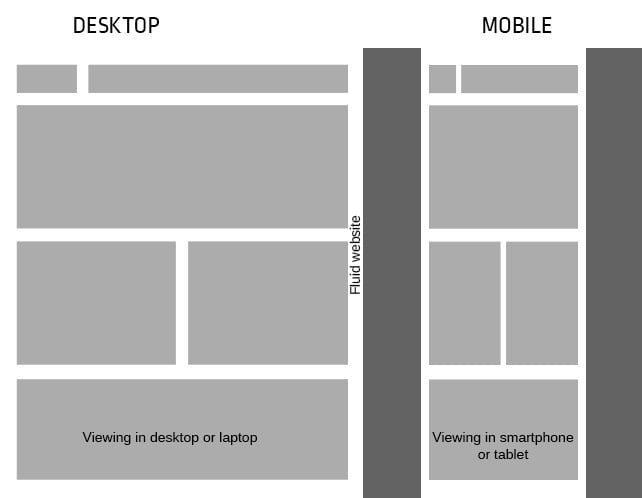
#2 Liquid / Fluid Design
Liquid or fluid design is one of the most preferred layout types of web designers. Most web design elements of a website are incorporated based solely on the percentage widths. This, in turn, creates a smooth browsing experience for your visitors. The percentage width that is designed for website elements can adjust perfectly well to the different screen sizes and fit the user’s screen resolution perfectly.
When resizing a web page, the content on the page expands itself out to fill in the necessary width of the browser, and will look enlarged or has shrunk, hence the term liquid design. The columns that are seen on a particular web page are built using certain percentage widths, rather than fixed columns, therefore the columns increase or decrease in size relative to each other. It supports a great deal in making the entire website operate well on different browsers and also setting up multiple widths to content, images, and videos to fit different screen resolutions is hectic for a lot of designers.
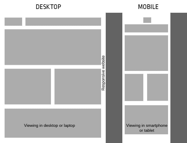
#3 Responsive Design
Websites created using responsive design are intended to display different content as the browser is expanded or reduced to predetermined sizes. This approach aims to make website viewing a lot easier and creates a smoother user experience. This avoids the user from having to pan, scroll or resize through the web page to read the entire website’s content. In other words, the website is clearly usable and viewable on desktops, smartphones, and tablets. When building a responsive website design, designers do not need to create multiple website formats that have been prepared for different types of devices.
The quality of videos and images are also downloaded separately depending on the speed of internet connection that the device is connected to. This type of layout aims to make any website easier to be displayed on different devices in designs that are quite easy to read and navigate. You need to see what makes it responsive and how some common design patterns work well across different devices. Those websites created using a responsive design are intended to effectively display various content as the browser is increased or reduced to different sizes.
What’s best for your company?
Companies need to analyze the type of devices their target audiences are viewing their website on to determine the best design structure for their website. For example, if your customers are not viewing your website on smartphones, don’t bother spending a lot of money or time on perfecting the responsive design structure and layout for smartphones. In turn, you may believe that due to the increasing popularity in smartphone use, your audience will be using smartphones and to stay ahead of the pack, prepare your website for every type of device out there. Each page layout name defines how the layout works when the page is being viewed at different browser widths. That’s why it’s important to understand what each design means and when each type of layout should be employed. Remember that understanding the differences between each one is the key to understanding them individually.