
View Video Playlists Full Designing Websites for Performance
https://www.youtube.com/playlist?list=PLSJUvA2v3Fs4-TYmAn8hGmP1R6ky4QSBT
– [Voiceover] In this video I just want to share a few general web design tips around performance. Things that might be helpful later on. One of the first things I suggest to people when they design websites is, if you’re going to build a bigger site or work with a team it’ll probably be a good idea to do something called Wireframe. Now you can do this in Photoshop, Illustrator, Sketch, any program you have, and Wireframe is essentially kind of how things interact. The hierarchy of contents, how things are going to generally work or look on a page, but it doesn’t technically include things like fonts, colors, the actual design elements necessarily, okay.
This is an example of mockingbird.com and what we can do is you can actually take content and start to work with it a little bit out here so we can do things like you know, put drop downs, put in text, placeholders, tell where a picture’s going to go, etcetera. I can delete content, move content around pretty easily. The whole idea is we’re trying to get the idea of where things are going to work and how they’re going to work together. There’s a lot of examples of this, like Wireframes CC, a big one is Axure, so you can use this one. A lot of bigger companies will actually use this.
These are just a few examples of the many wireframing and some actually take it as far as prototyping, which essentially means you can take the wireframe and add interactivity to it just to show how something might work. This can also be a great way before you go you know design in Photoshop or build the site itself, to figure out if something is too complex like an animation, or you know a video page or something like that, that may slow the loading of the page. Another thing that can help performance when you design is to design to a grid.
Now that doesn’t mean that we’re just trying to make everything look the same across the web, it means that we’re designing to a fluid grid or something that’s already in code, for instance. If you’ve ever heard of Twitter Bootstrap or WordPress themes or, you know different starting points for an actual site. A lot of that code has built-in columns. If we design to those columns, it can actually be easier for the developer or the person creating it, once they get a design. It can also make it so that things are a little bit more uniform and there might be less code to achieve a design.
So for instance in Photoshop, if I come up here to File, I could say New, come in and pick Artboards, for instance and I can choose from different sizes if I want to. I could say iPhone 6 right here. Click OK. And the great thing about a lot of these programs that we can work with, especially let’s say Photoshop, is if I come into View you can see New Guide Layout. By choosing this, this is later versions of Photoshop CC. We can set guides up to design to across all Artboards or selected Artboards and pick how many columns we want to design to for instance.
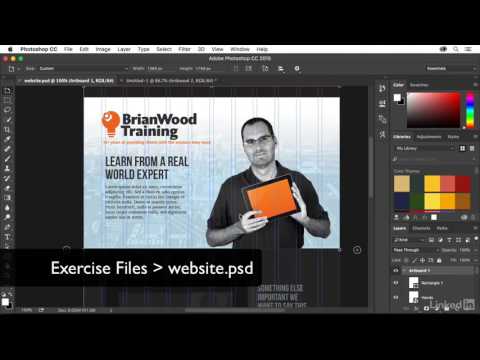
In this same vein, what we want to do in a lot of these programs is we want to be able to convey responsive design. This can cut down in the number of elements you use and potentially make loading faster, we can use Artboards. In Photoshop if I click on the Artboard name here, which I started with, I can go and click on a plus and create another Artboard for myself. This Artboard then can change size, orientation, and more. That makes it so we can have different sizes, different orientations in the same Photoshop file, allowing us to work a little bit smarter.
Something else we want to do is we want to maintain consistency. If you’re going to use a font, let’s say a font right up here, instead of using Bebas Neue Regular, Bebas Neue Condensed, Bebas Neue, you know Condensed Italic, you know all these, like 15 different versions of a single font, we’re going to try and be a little more consistent with our formatting. That’s going to cut down on the number of fonts that load, how things work across the site as a matter of fact. We’re also going to try and make sure that the colors we use are consistent. I can’t tell you how many times I’ve been to a site and I come to an object like this gray box right here and if I go and look at it and look at the color, it might be a different shade or different RGB value than the same gray box further down the page.